Services
Landing page design, and when you need one
Landing page design in Australia: one page built for one purpose, usually because you're paying for the traffic on it. When it's worth building.
In short. A landing page removes decisions, not words. It is worth building when you are paying per click, when a campaign has its own offer, or when you want a clean comparison. It cannot fix a weak offer, and it cannot fix enquiries that sit unanswered for two days.
A landing page is a single page built for a single purpose, with everything that does not serve that purpose removed. It is the page you send paid traffic to, and it is measured rather than admired.
Measured for Australia on 31 July 2026 and recorded in research/national-volume-au.json and research/cpc-competition-au.json, “landing page design” draws 260 searches a month at a keyword difficulty of 25, with competition recorded as LOW at an index of 14 and advertisers paying 8.92 AUD CPC. research/ai-vol-keywords.json records 3 prompts a month to AI assistants for the term, which is close to nothing and worth knowing before anyone builds a content strategy around it.
How a landing page differs from a website page

A website page is part of a structure. It has navigation, it links outward, and it serves several kinds of visitor at once, because you do not know who arrived or why.
A landing page assumes you do know. Somebody clicked a specific advertisement about a specific thing, and the page exists to continue that exact conversation and finish it. So the navigation usually goes, the outbound links usually go, and the page holds one offer and one action.
That is the whole discipline. Not fewer words, not a nicer design. Fewer decisions.
When you need a landing page for SaaS, real estate or any industry
You are paying for the traffic. This is the main case. If money is being spent per click, sending those clicks somewhere general wastes a proportion of every dollar spent, including the GST on it.
You are running a campaign with its own offer. A seasonal promotion, a new service line, an event. The offer needs a page that matches the advertisement word for word, and it needs to be removable afterwards without leaving a hole in your site.
You want to test something. Two versions of an offer, two ways of describing a service. A standalone page makes that comparison clean.
The audience is narrow. A page written for one profession, one region or one situation can be far more specific than any page on your main site is allowed to be. A SaaS business running a trial-signup campaign, a real estate agency promoting one listing, or an ecommerce store pushing one product line are all narrow-audience cases where a dedicated landing page earns its cost.
When you do not need a landing page: the page furniture worth saving
When traffic is arriving through search rather than advertising, a proper service page usually outperforms a stripped landing page. It can rank, and a navigation-free page generally cannot support the wider site.
When your offer is a conversation rather than a transaction. Some services genuinely need people to browse, read about the team, and decide slowly.
When you have one offer and a small site. If your home page can be made to do this job, make it do this job. A separate page you then forget to maintain is a liability.
And when the campaign is small enough that the build cost exceeds the media spend behind it. A landing page has to earn its own construction.
The anatomy of a landing page design: image, examples and page design tools

There is no magic order, but the elements below are the ones that recur across the best landing page examples in every industry, and each has a job. Looking at landing page examples from a SaaS trial signup, a real estate listing and an ecommerce product launch side by side shows the same anatomy repeating, regardless of industry. The same anatomy holds whether the page design tools involved are a simple page builder or a full custom build.
A headline that repeats the promise of the advertisement. If the ad said same-day repairs in Brisbane, the headline says same-day repairs in Brisbane. Message match is the single most common failure and the easiest to fix.
An image that matches the offer, not a generic stock photo. A hero image showing the actual product, the actual property or the actual work reinforces message match the same way the headline does; a mismatched or generic image quietly undermines it. Some page-builder tools now offer artificial intelligence assistance for a first-draft layout or image selection, but the proof and objection-handling sections still need a person who can substantiate the specific claims being made.
A subheading that adds the qualifying detail. Who it is for, where, and any condition attached.
One primary action, above the fold and repeated further down. Call, book, or a short form. One action, not three competing ones.
Proof appropriate to the claim, meaning specifics you can substantiate: process, credentials, licence numbers, photographs of real work. Anything you display about customer experience carries obligations under Australian Consumer Law, so display only what you actually hold and can evidence.
The objection handling. The three or four reasons people hesitate, answered plainly. This is usually the section that does the most work and the section clients most often want to cut for tidiness.
The practical detail. What is included, what it costs or what drives the cost, whether GST is included in any figure shown, how long it takes, and what happens next after they contact you.
A short form. Every additional field reduces completion. Ask for what you need to make the first call, not for what your customer database would enjoy having.
Speed and a phone layout that works. Most of this traffic is on a phone. A page that takes several seconds to appear is a page you paid for and did not get.
Why sending ad traffic to your home page wastes money for any agency or ecommerce site
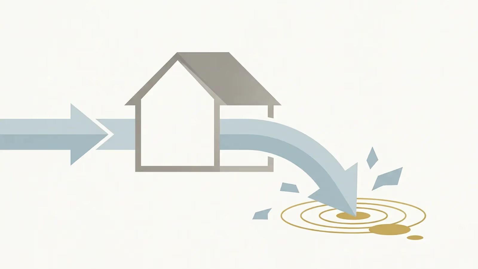
A home page is a menu. It is designed to send people onwards to the right place, which means the visitor has to make a choice before anything else happens. That is true whether the business behind it is a SaaS product, a real estate agency, an ecommerce store or a service agency — the menu problem does not change by industry.
When the click was free, that costs nothing. When you have paid for the click, you have paid for the privilege of asking somebody to choose from a list, and a proportion of them will choose the back button instead. The waste is not dramatic per visit. It compounds over a campaign, and it is entirely avoidable.
The related problem is measurement. If every campaign points at the same page, you cannot separate what worked from what did not. Separate pages give you separate numbers, and the numbers are the reason for doing this at all.
Measurement, and what conversion rate actually means
Conversion rate is the proportion of visits that produce the action you defined. It is a fraction, and both halves of it can be manipulated, so define it before the page goes live.
Decide what counts as a conversion. A submitted form is unambiguous. A tapped phone number is a reasonable proxy but not proof of a conversation. A page view is not a conversion, and any report that treats it as one is decoration.
Then note two things that regularly mislead small businesses.
Small numbers are noisy. A page with forty visits and two enquiries has a rate you cannot rely on. The difference between a good week and a poor one at that volume is one person. Give a test enough traffic to mean something before you act on it.
A conversion is not a customer. Enquiries include the unsuitable, the out-of-area and the not-yet-ready. Track what proportion of enquiries becomes work, because a page with a lower conversion rate and better enquiries is the more valuable page, and the headline metric will tell you the opposite.
The honest limits of a landing page: multiple landing pages will not fix it
A landing page cannot fix a weak offer. The thing being offered might not be attractive, might be priced without reference to what people will pay, or might be aimed at people who do not want it. In any of those cases, a well-built page will simply establish that fact faster and at a lower cost per click than a poorly built one. That is genuinely useful information, but it is not the outcome most people are buying.
It also cannot fix the parts of the process that happen afterwards. Enquiries that sit unanswered for two days convert poorly regardless of the page that produced them. Nobody can promise you a conversion rate, and any figure quoted to you before the page exists is a guess with confidence attached.
Common questions about landing page design
Should I send my advertising traffic to my home page? Generally not. A home page is a menu, so a paid visitor has to make a choice before anything else happens, and a proportion will choose the back button. It also makes measurement impossible, because every campaign pointing at one page cannot be separated into what worked and what did not.
What counts as a conversion? Whatever you define before the page goes live. A submitted form is unambiguous. A tapped phone number is a reasonable proxy but not proof of a conversation. A page view is not a conversion, and any report treating it as one is decoration.
What to have ready before you commission a landing page
- The offer, stated in one sentence, including any conditions.
- The advertisement text and the search terms or audience it will run against, so the page can match them.
- The single action you want, and where the enquiries will land.
- Your evidence: photographs, process detail, credentials, licence numbers.
- Answers to the four questions people ask before buying this specific thing.
- Any figure you intend to show, with GST treatment decided, inclusive or exclusive, stated on the page.
- Who will answer the enquiries, and how quickly.
- How long the campaign runs, and what happens to the page afterwards.
For how a page like this fits into a wider site, see what a small business actually needs. If the words are the weak link, copywriting as a separate line covers that separately.
Evidence for this page
This page exists because the demand below was measured, not assumed. The figures are search-market data about the topic — they are not prices.
- Entity this page targets
- landing page design
- Measured Google volume
- 260 searches/month, Australia
- Keyword difficulty
- 25 of 100
- Advertiser cost per click
- 8.92 AUD CPC
- AI assistant volume
- 3 prompts/month
- Advertiser competition
- LOW (index 14 of 100)
- Measured on
- 31 July 2026
- Search results inspected for intent
- No
2 other phrasings resolve to this same page
landing page design australia · landing page design services
AI-assistant demand for this entity is 3 prompts a month, which is close to nothing. This is a Google page and no assistant-optimisation effort belongs on it.
Source: research/national-volume-au.json + research/cpc-competition-au.json + research/ai-vol-keywords.json · DataForSEO Labs and AI Optimization, location_code 2036 (Australia), language en · pulled 31 July 2026.
Provenance
Written by Australian Website Design. Published 2026-08-03, last updated 2026-08-03.
Sources
- National keyword volume and difficulty, Australia —
research/national-volume-au.json(accessed 2026-07-31) - Advertiser cost-per-click and competition, Australia —
research/cpc-competition-au.json(accessed 2026-07-31)